A walk to rememeber- Analysis of webpages
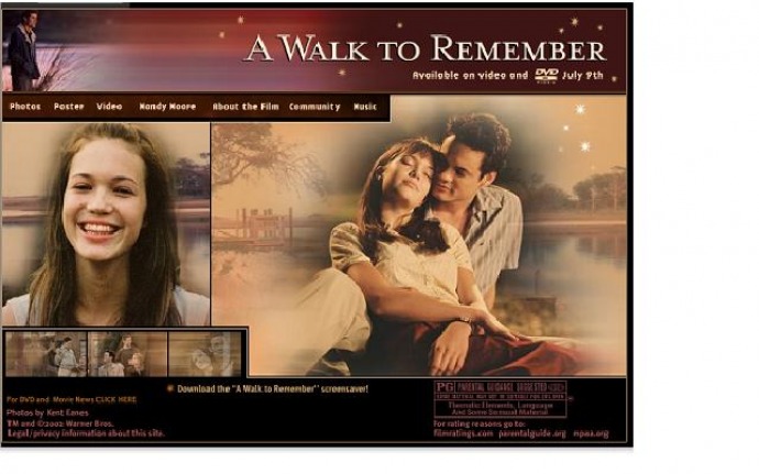
Homepage.
- Images of the characters in the film- to make the audience familiar with the characters in the film, give the audience an insight on what the movie is about. Some moving images to make the website engaging.
- Single image of a girl, suggesting she is an important character in the film.
- Image of a girl and boy closely together, look like they are in love- suggests that this film is about a romance.
- Colours used go with this romantic theme, pinks and peaches. Further the stars contribute to this romantic feel.
- As the characters in this film are young I suggest this film would be targeted at teenagers and young adults. The genre of this film seems to be ‘romance’.
- Tabs at the top of the page leading to the other pages of the website- easy to navigate
- Age rating of the film provided to make audiences aware of whether or not they are able to view the film. This is on the home page as audiences will immediately know whether or not they should continue viewing the website depending on their age.
- Title of the film written in a large bold white font to stand out. The rest of the text on this page is written in a smaller font.
- Links leading to more content, for example there is a link to ‘DVD and movie news’
- Warner bros the producers of this film is indicated on this page- makes audiences aware of who the producers are.
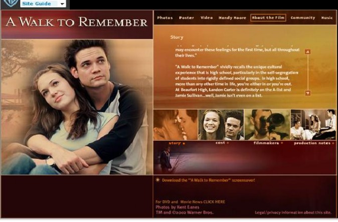
About the film PAGE
- When opening this page, all the images are titles are slowly put in place, making this page engaging and interesting.
- There are four boxes you can click which gives you different information about the film. I.e. one provides you with the story of the film, the other cast members, filmmakers and production notes.
- It is stated that this movie is based on the ‘ best selling novel by Nicolas Sparks’, suggesting that this film is likely to be very good as it is based on a successful novel.
- The colour of this page continues from the colour of the homepage, warm colours to go with the theme of the film.
- Large image of 2 characters closely together, suggesting they are the main characters in this film who are in love.
- Tabs remain at the top of the page, making it easy for viewers to leave the page and go to another one.
- Title of the film remains in large, bold, white writing- emphasising its importance.
- Most of the text on this page is white to stand out from the background.
- Producers Warner bros symbol remains on the top of the page, and there is a link to their website, if viewers are interested to find out about them and their other productions.
- There is a link to download the walk to remember screen saver – makes the viewers interactive.
